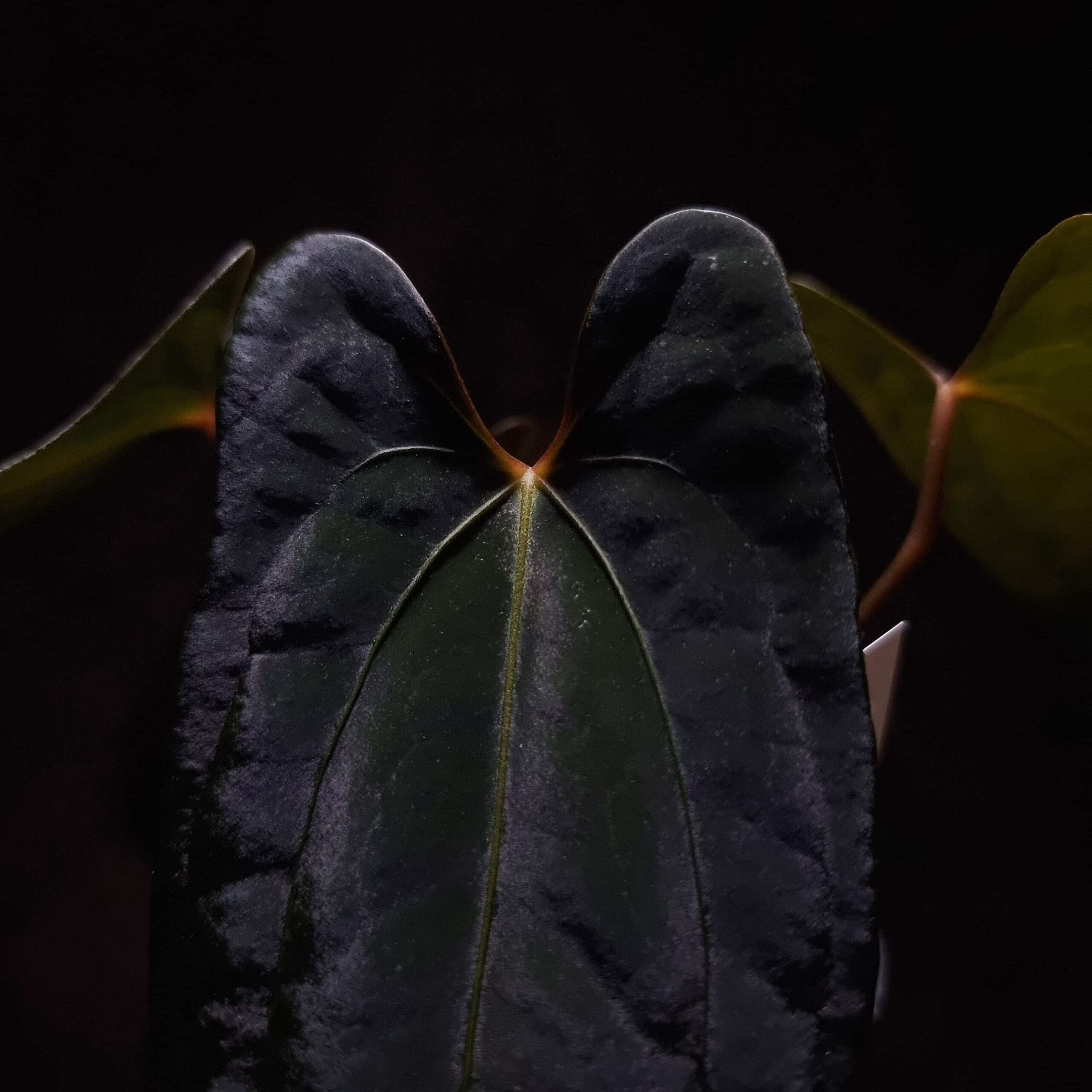
A Logo by Selawase Aroid
It all began with a simple line and big dreams. Driven by passion and purpose, we defined a set of guiding principles that would anchor us through the creative chaos of sketching and brainstorming. Every detail mattered, but we remained committed to ensuring that our logo would not just represent a plant but also the essence of who we are.
Our initial requirements were defined as the following: it should represent Anthurium character and veins, has soft and strong edges, a simple design, describes Selawase Aroid, and leave impression.
But we chose not to include the distinctive veins of anthuriums in our logo because we believe the true beauty of these exotic veins lies in their incredible variety. By leaving the middle part open, we invite creativity, allowing each viewer to envision their own unique veins, just as every anthurium leaf tells its own story. We kept it simple and elegant, focusing on what truly matters.
As we refined the design, it evolved into a clean, minimalist symbol that speaks volumes without unnecessary detail. We aimed for something timeless yet modern, capturing the essence of the rare and unique anthuriums we offer.
In regards to that we would like to introduce Selawase Aroid’s three main colors which play a significant role in our identity:
#f5f5f5 – white
Simplicity, the foundation of our design philosophy.
#181818 – black
Rarity and elegance, representing the uniqueness of our offerings.
#112311 – green
Growth, reflecting the vitality of nature and the continuous evolution of our plants.
In conclusion, the logo reflects Selawase Aroids’ core principles through its simple design and meaningful symbolism. The soft edges, heart-shaped sinus, and distinct leaf contour symbolize the uniqueness of the anthuriums we offer. It’s a visual story of our commitment to providing elegant, rare, and growing plants that inspire and captivate.

